KB HOME
Designing the first native app from a US homebuilder.
A 6-month build cycle inside a 3-year roadmap. Launched Fall 2025. Currently in active feature development.
ROLE
Senior Product Designer
CLIENT
KB Home
SCOPE
UX, prototypes, design system
BACKGROUND
What was the situation.
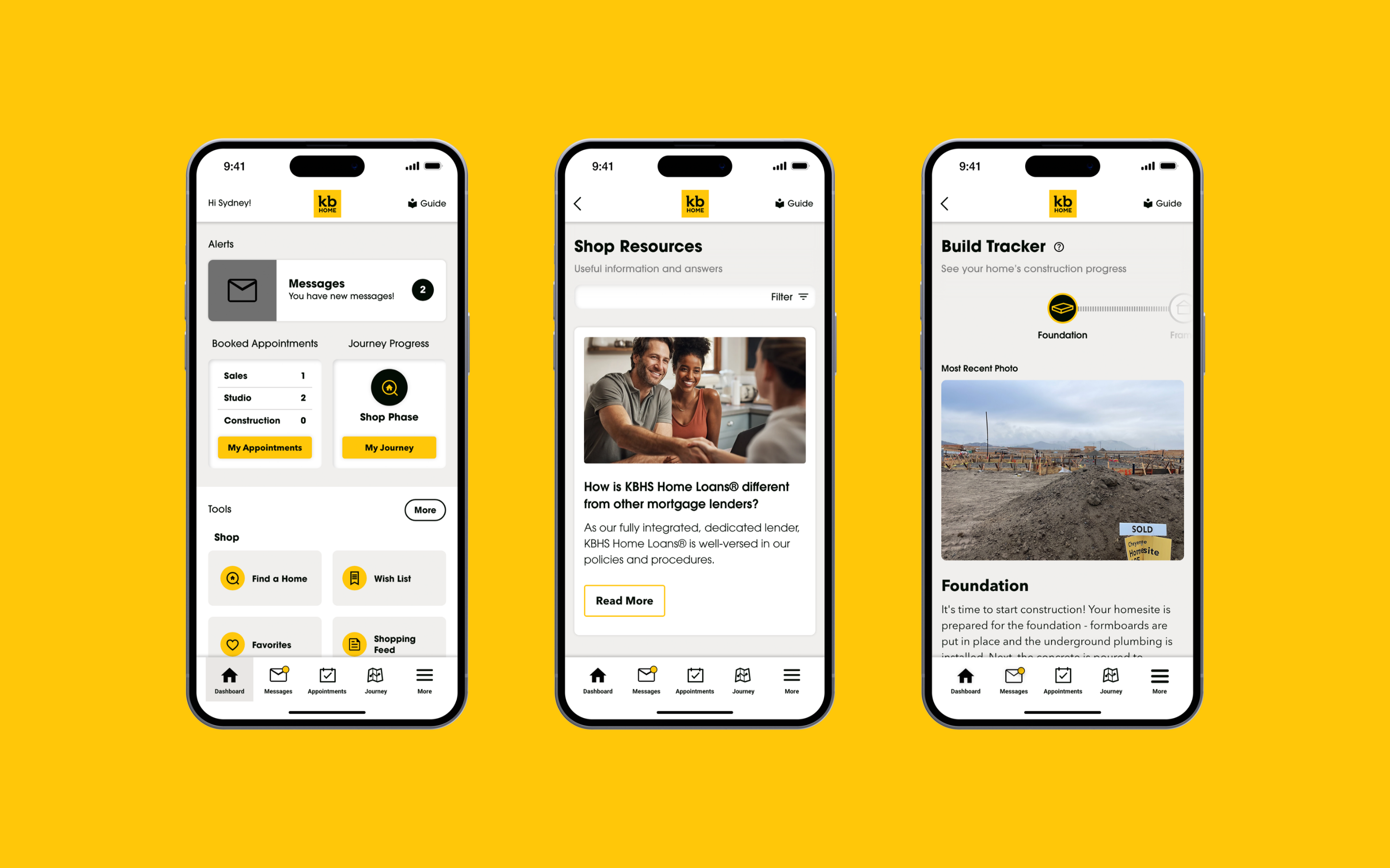
By early 2024, KB Home had spent three years rebuilding its digital experience — a redesigned website, then a buyer-facing dashboard. The dashboard worked. People were using it. But 70% of KB Home's web traffic was coming from mobile, and KB Home didn't have an app.
The dashboard could tell a homebuyer where their build was up to. But finding out meant logging into a website on a phone, and the moments buyers most wanted that information weren't moments where opening a browser felt natural — they were moments at dinner, in line at Target, lying awake at 11pm wondering whether the framing was on schedule.
For the buyer, the real problem was something we ended up calling "the unknown" — the months between contract and move-in where you've made the biggest financial commitment of your life and have no idea what's happening to it. Build updates went out by email when a sales rep remembered. Buyers who wanted information called their rep, which overwhelmed support staff and turned the rep into a manual notification system for their own customers.
THE CHALLENGE
The actual problem we were solving.
The brief looked simple: build KB Home's first native iOS app, with notifications and direct messaging. The real problem was harder, because the app had to do four things at once.
It had to make "the unknown" feel known, without burying buyers in build-detail noise. It had to consolidate fragmented buyer communication into a single channel — reps were running parallel conversations across SMS, email, and personal text threads, and leadership wanted those inside the platform where they could be logged and not lost when a rep left.
It had to ship as an employee app first, used internally for months before any customer pilot, with the same architecture serving both audiences without compromising either.
And it had to set the foundation for something bigger. Leadership was explicit: be the first US homebuilder to offer the entire homebuying journey — search, purchase, close, ownership — inside a single native app. No competitor was doing this. What I designed was Phase 1 of that. That last point shaped everything.
THE WORK
Research, principles, then three screens tested — two killed.
Internally, we mapped how buyer communication actually flowed with sales, support, and construction ops. The pattern was consistent: information lived in too many places, owned by too many people, with no single source buyers could go to. A buyer asking "is my build on schedule?" might need three internal handoffs to get an answer that was sometimes already out of date.
Externally, no homebuilder had a native app. So we benchmarked outside the category — Carvana for big-ticket transactional UX, Zillow for property-state visibility, banking apps for the trust-and-clarity bar that financial-scale decisions demand.
That reframed the project. The app didn't need to surface every event in the build process — that would just digitize the existing noise. It needed to communicate steady-state confidence, with detail available on tap. The default state, for most buyers most of the time, should be a quiet confirmation that nothing is wrong.
A few principles came out of that. Default to calm: the home view is the buyer's home — one tile showing their property, current phase, and a clear "on track" state. Not a feed. One channel for buyer comms, with conversations preserved across staff turnover. Phase 1 as real product, not a stripped-down beta, or we'd pay the rebuilding tax twice. And native iOS conventions rather than web parity — which would later become a flashpoint.
The early wireframes tested three home-screen models. A timeline view, killed in week two: even simplified, it felt like the notifications inbox buyers were already burning out on. A dashboard view, killed because it solved KB's problem (showing everything) without solving the buyer's (just tell me if it's fine). And a single-tile view — one card, one clear status, messages and documents as secondary affordances. That's what shipped.
THE PIVOT
A design system, then a leadership pivot, mid-flight.
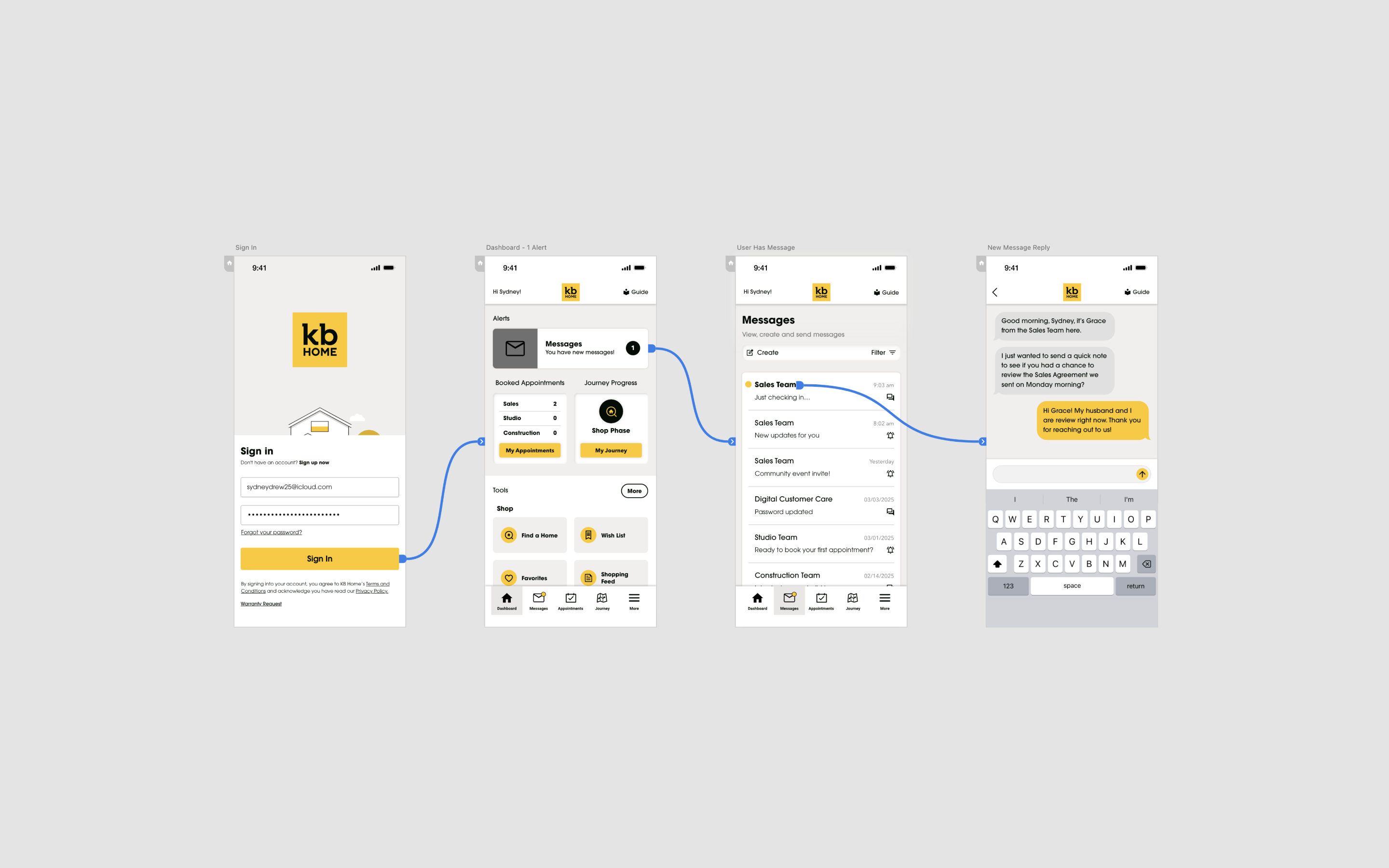
I built the high-fidelity prototype across late 2024 and into 2025. The dev team built the CMS in parallel, structured around the IA the design defined — so the design didn't just inform the app, it informed the system that powers it. When KB Home's content team adds a new build phase now, the app updates automatically.
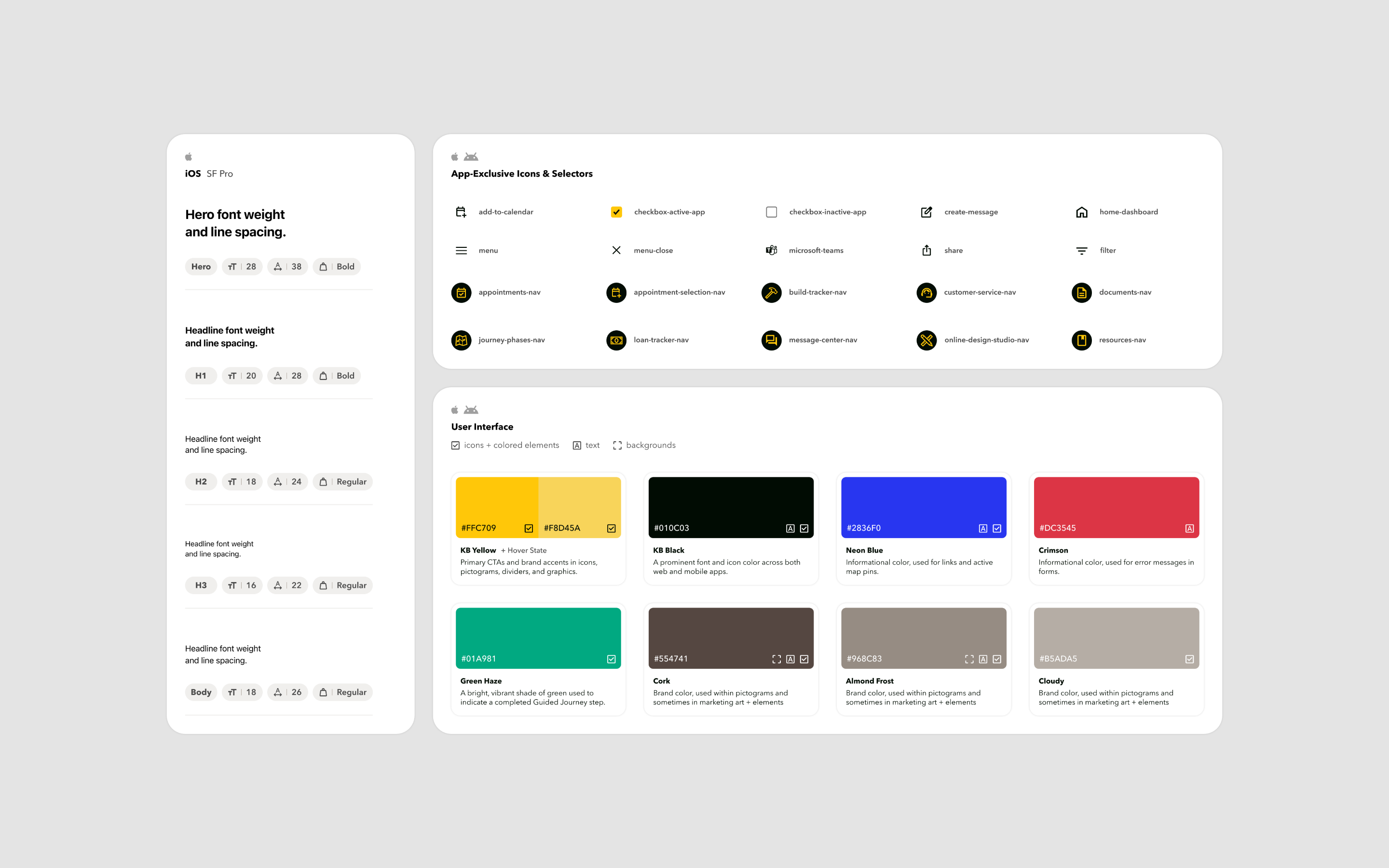
Around the same time I noticed I was spending hours every week chasing assets from stakeholders who took 48+ hours to respond. There was no shared design system. Every screen was built from scratch and every reviewer applied their own version of the brand. I pitched a design system as a separate workstream. They went for it. It became KB Blueprints, and it ended up adopted across KB Home's entire digital portfolio.
By early 2025 the app was real — running through TestFlight with staff using it in the field, feedback folding back into the design every sprint. Then KB Home's CMO called to bring the app's visual language into closer parity with the existing website.
The shipped app is good: the architecture, IA, flows, messaging system, and design system all survived intact. But the visual language that ships today isn't the one we'd been validating. The hard part wasn't the call itself — leadership has the right to make brand decisions. It was the timing. We were mid-flight, with engineering already building and employees already using it in production conditions. It's the part I'm least satisfied with creatively, and the part I'm most proud of operationally, because the schedule held.
OUTCOME
What shipped, and what is still shipping.
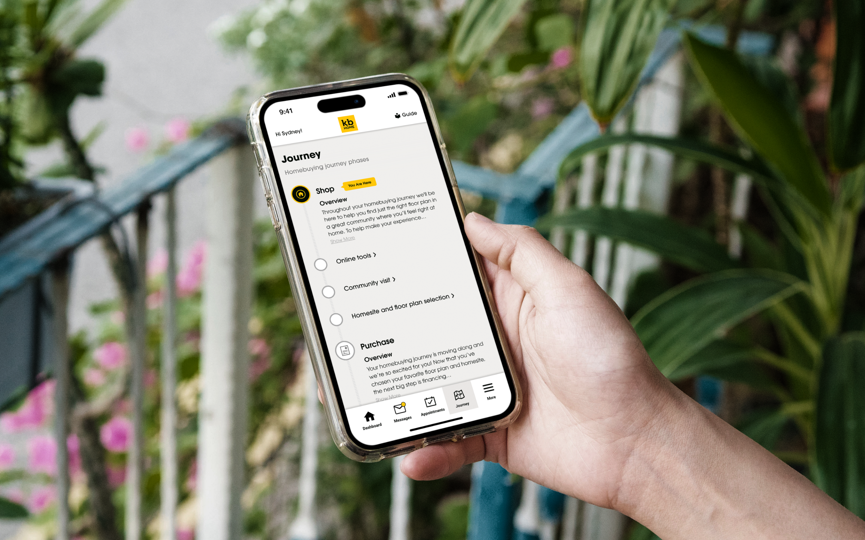
The app launched in Fall 2025 as KB Home's first native iOS application — and the first native app from a US homebuilder. It's in active development now, with the team shipping group messaging boards, DocuSign integration for in-app contract signing, SSO, and build-to-order configuration. New features ship roughly every six weeks.
KB Blueprints is the design system of record for KB Home's digital products. The thing I pitched to unblock my own asset requests turned into the operating layer for the broader portfolio.
REFLECTION
What I would do differently.
I'd treat executive visual alignment as a separate workstream from product alignment. We had sign-off on the product — strategy, scope, IA, flows all validated through TestFlight before the visual was questioned. What we didn't have was a parallel track of executive review on brand language. Next time I'd run those in parallel from week one rather than discovering the disconnect mid-flight.
I'd push for native-first conventions harder, with documentation. When you're designing an iOS-native experience for a brand whose surfaces are all web-based, "this is how iOS works" isn't enough — you need the why, with comparables and evidence, in writing, before someone senior asks.
And I'd plan for the post-purchase audience. Buyers are in the app for 6–12 months, then their home closes and they have no reason to open it again. The answer is a homeowner-services surface that turns a homebuying app into a home ownership app. That's right — I just wish we'd designed for it from day one rather than as a Phase 5 conversation.