KB Home
Giving KB Home buyers a home base for a homebuying journey that takes months.
A customer-facing dashboard designed end-to-end — wireframes through final UI — as part of KB Home's broader Web 3.0 personalization push, centralizing communications, saved homes, and progress in one place for buyers navigating a process that can run for months.
ROLE
UX & UI Design (wireframes through full UI)
CLIENT
KB Home
TEAM
Stellar Agency
BACKGROUND
Buying dirt, not a house.
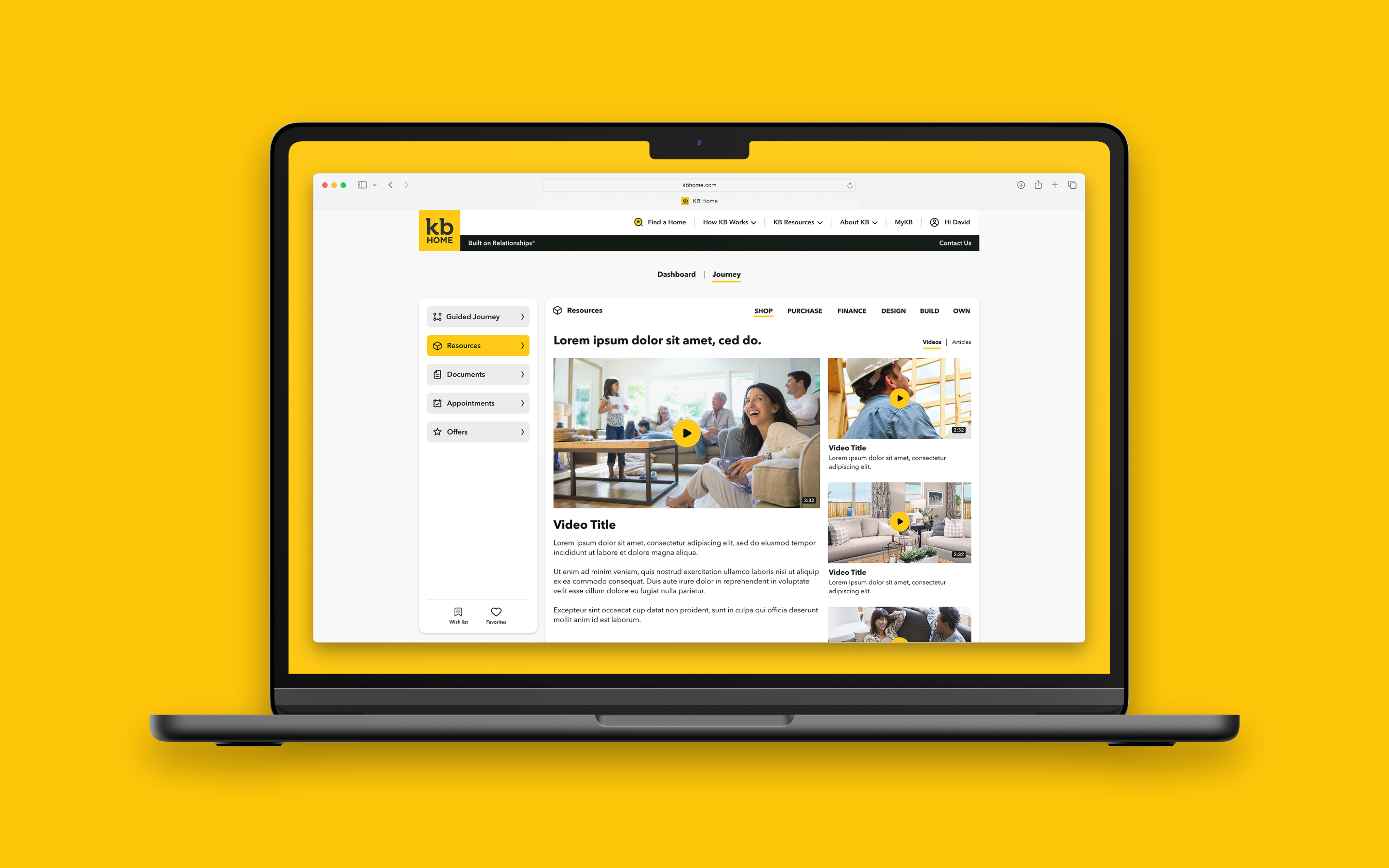
In 2022, KB Home's CMO asked a deceptively simple question: in the future, will customers want to buy homes entirely online? That kicked off a multi-year engagement — a redesigned website, then Web 3.0, an ambitious push to build a genuinely personalized homebuying journey with a suite of shopping tools behind it. My role was UX and UI design execution, and the Dashboard was the piece I owned end-to-end.
The research surfaced a real structural problem. When you buy a home from KB, you're often buying a homesite in a community that hasn't been built yet — you can't drive up and see it. And most KB buyers don't have a real estate agent: no professional in their corner through a process that takes months and involves dozens of small decisions along the way. KB's own tagline was "Built on Relationships," but the site did almost nothing to support that. It was a search funnel, not a relationship.
THE CHALLENGE
A buyer with nowhere to come back to.
Homebuying with KB isn't a single-session transaction. It's a long relationship: a buyer favorites a few floor plans, gets matched to communities, watches a home get built, communicates back and forth with KB — over weeks or months. The old site had no home base for any of that. Every visit was a fresh search, with no persistent thread connecting a buyer's saved homes, their progress, or KB's communications with them.
The Dashboard needed to become that home base: a single place a returning buyer could land and immediately see what mattered to them — saved homes, personalized recommendations, and the communications KB needed to have with them — instead of starting over from a generic homepage every time.
THE WORK
From wireframes to a working home base.
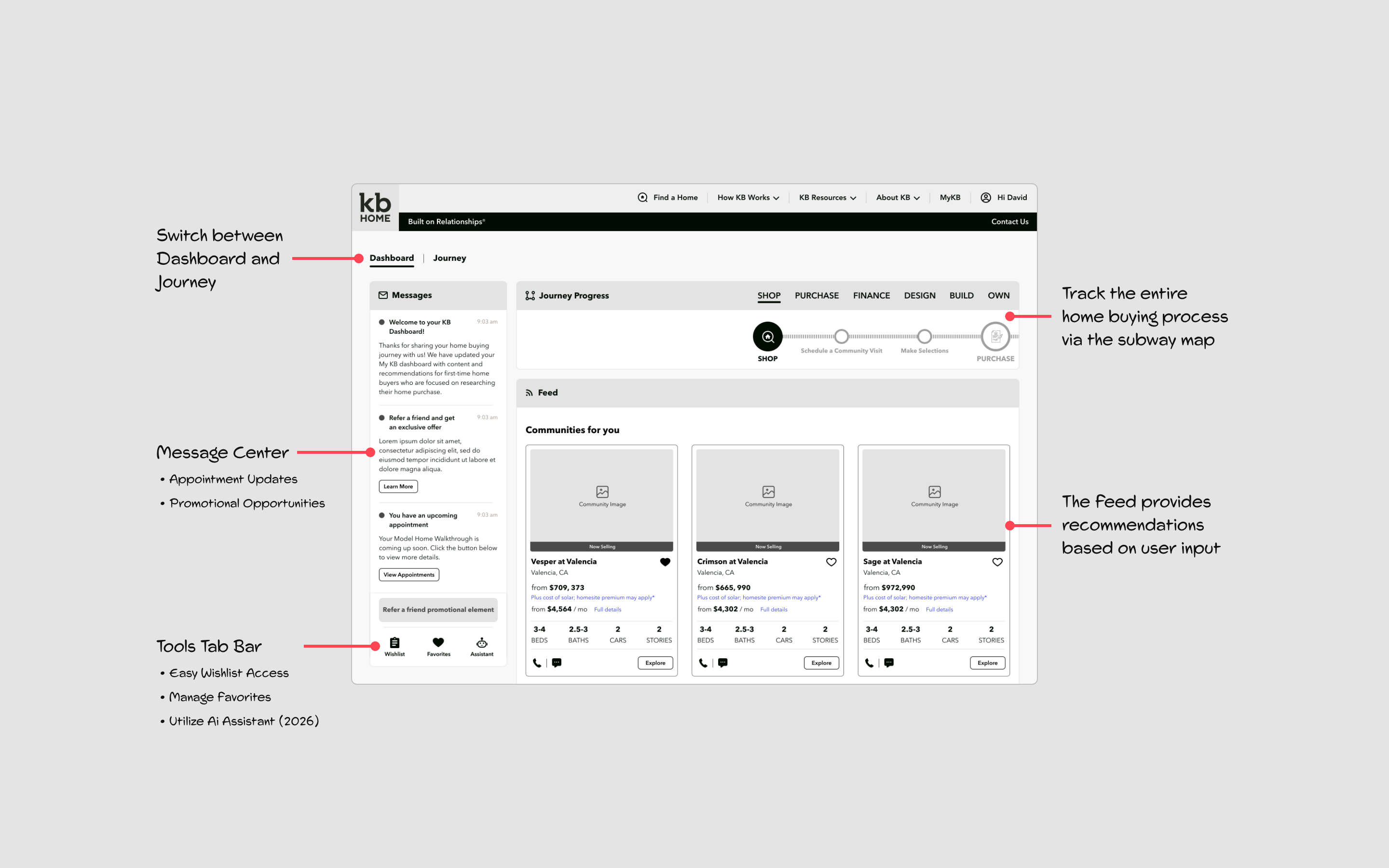
I designed the Dashboard from wireframes through final UI, built on the strategic frame for the broader Web 3.0 personalization system. Its core job was consolidation: bringing customer communications, saved Favorites, and a personalized Feed into one persistent location, so a buyer's relationship with KB had somewhere to live between visits.
The Feed was generated from a Wish List the buyer created — communities, floor plans, and move-in-ready homes matched to their stated criteria, surfaced automatically rather than requiring a fresh search every time. Favorites gave buyers a lightweight way to mark homes they cared about without committing to anything. Together, they turned the site from something a buyer searched cold each visit into something that remembered them and picked up where they left off.
The Dashboard shipped as one piece of a larger system that also included dedicated shopping tools, a guided journey for buyers who wanted more structure, and Find a Home — all built on the same personalization strategy and designed to work together rather than as isolated features.
OUTCOME
A real conversion lift, on a system I helped build.
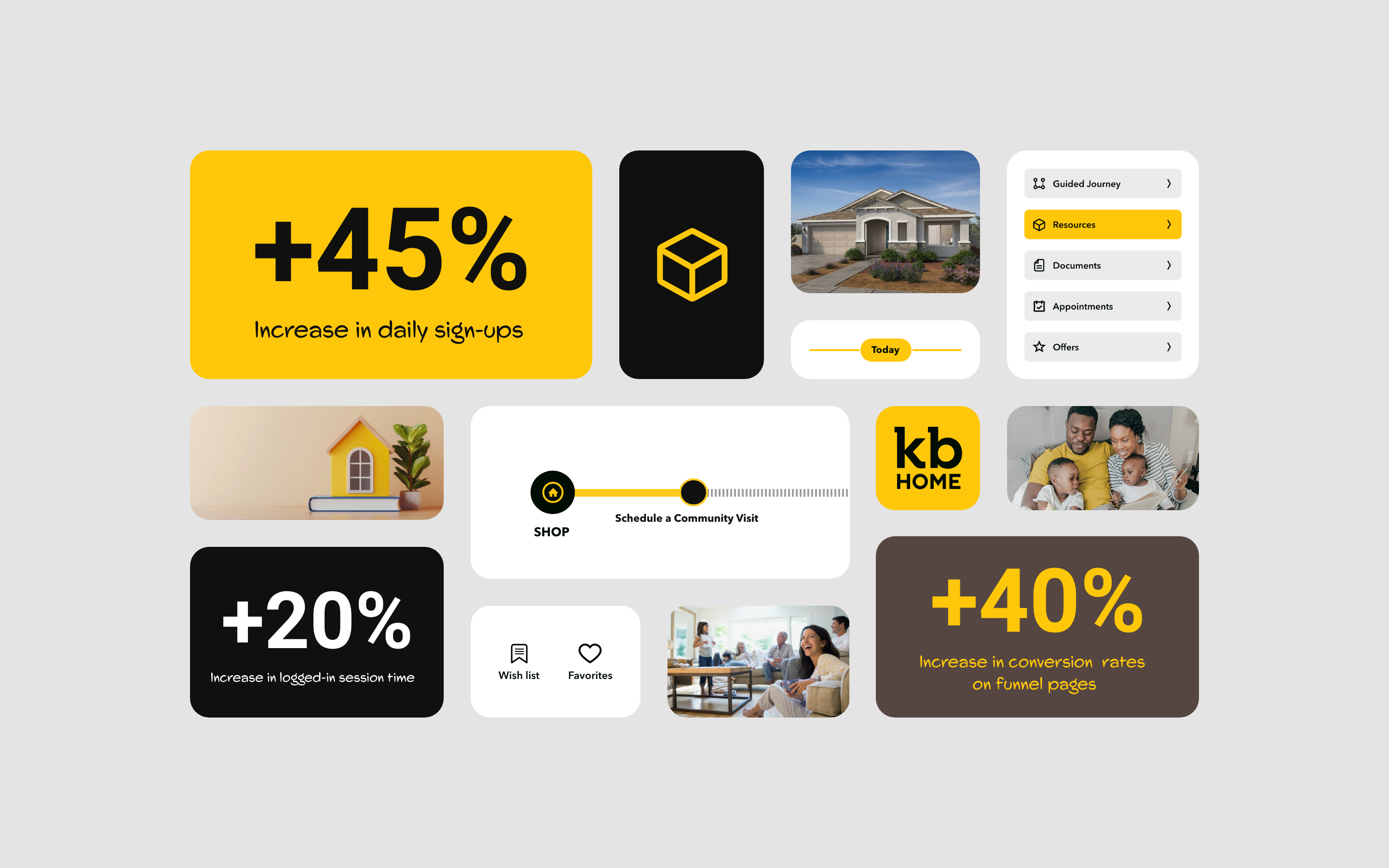
The broader personalization push — Favorites, Feed, and Wish List working together, with the Dashboard as the home base tying them together — improved conversion on funnel pages by +45%. That number belongs to the system as a whole rather than the Dashboard in isolation; I can't cleanly separate how much traces specifically to it. What I can say directly: the Dashboard was a fully-designed, shipped part of the system that produced that result, and it was the piece I owned from first wireframe to final UI.
REFLECTION
Designing for a relationship, not a session.
The shift that mattered most wasn't visual — it was structural. Most e-commerce-style design assumes a session: a user arrives, searches, converts, leaves. Homebuying doesn't work that way. It's a relationship that unfolds over months, and a site that treats every visit as a cold search is fighting how the actual behavior works.
Designing the Dashboard meant designing for return visits as the default case, not the exception — building a place that remembered a buyer's Favorites and Wish List and picked the conversation back up, rather than making them re-establish context every time. That's a different design problem than most funnel-optimization work, and it's the one I'd bring into any future project involving a long, high-stakes customer journey rather than a single transaction.