HPE
Designing the AI customer experience for HPE's software portal.
Designing the AI experience for HPE's enterprise customer portal: three surfaces, three jobs, one interactive demo that reframed the conversation.
ROLE
UX, UI, interactive demo
CLIENT
HPE (via Stellar)
DELIVERABLE
Vision prototype + strategy
BACKGROUND
What HPE asked us.
Stellar has been HPE's design partner since 2017. Long before I joined, the team built My HPE Software Center from scratch — the self-service portal where HPE's software customers activate licenses, manage subscriptions, and handle the rest of the B2B procurement work that keeps enterprise IT running. By 2025 it was mature, mission-critical, and carrying eight years of accumulated complexity on a product that can never break.
Then HPE came to us with an open question: what AI services do you offer, and how could we use AI on MSC? Not a brief. A starting point.
Most agencies would answer that with a feature — a chatbot, a smart assistant in the corner. We had a different read. From years on MSC, we knew the real complexity sat where a single feature couldn't reach: new customers struggling to onboard, repeat users running the same multi-step queries every week, and the long tail of "I know this is possible somewhere but I can't remember how." The answer wasn't one AI feature. It was a model for where AI lives in the product and what each surface is for.
THE CHALLENGE
The obvious answer was the wrong one.
By late 2025 the "AI experience" pattern was culturally settled: a chat window, front and center, taking most of the screen. ChatGPT, Gemini, and Claude had made that the default expectation, and it would have been the easy, defensible choice — easy to design, easy to explain to stakeholders, easy to benchmark.
The problem is that MSC's users aren't having conversations. They're doing work — pulling filtered subscription lists, checking entitlement counts, running the same handful of queries across a workday. A full-screen chat interface optimizes for the exploratory session, when what they need is fast, repeatable access to structured output they can act on.
There was no precedent to lean on. The products setting the standard were built for consumer-style exploration, not a professional running the same eight queries a hundred times over. Getting this right meant designing against the grain of where the entire industry's attention was pointed — and explaining why, to a senior audience already primed to expect the ChatGPT thing.
THE WORK
Three surfaces, and the hardest one built out.
The Director of Strategy and I thrashed it out together, and the move we landed on was that AI shouldn't be one thing on MSC. It should be three things, in three places, doing three different jobs — because that's how people actually want to engage with an assistant at different moments in their day.
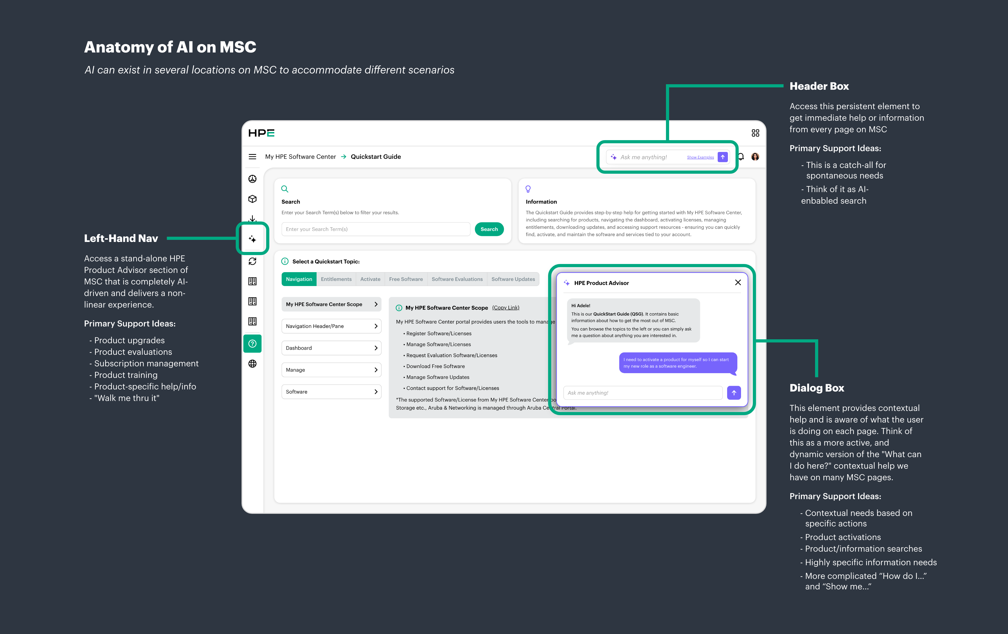
Ambient query lived in the global nav: a persistent input field on every page, for the spontaneous "I need to activate some licenses in bulk" moment. Low commitment, high reach — think Spotlight, not a chatbot. In-task assist lived as a contextual dialog that knew what the user was already doing and helped with that, meeting them inside the task rather than beside it. And the dedicated workspace lived behind a nav button: a full AI page with history, saved tasks, and suggestions, for users who want the assistant as their primary tool.
The workspace got the deepest treatment because it was also the riskiest — the place where defaults from consumer AI products would be hardest to resist. The first decision was screen real estate. The dominant 2025 pattern gave the entire screen to the conversation. MSC users don't come to chat; they come to do work that produces tables and filtered views they then need to see. So the conversation panel stayed deliberately small and the bottom two-thirds went to whatever it produced. Chat became the input mechanism. The output got the room.
The second was reuse. MSC users run the same multi-step queries every week, and in a typical AI product they re-prompt every time. So conversations could be saved as reusable Tasks — one click, same query, same filters. It answers a question most AI design dodges: what's the long-term relationship between a user and an assistant they use professionally, every day? For consumer AI, every conversation can be ephemeral. For B2B procurement, the user isn't exploring — they're running the same eight queries forever, and the assistant should reward that.
PRINCIPLES
Designing for transparency.
The strategic frame included five UX considerations for AI: transparency, user control, natural conversation flow, personalization, and predictability. Transparency did the most visible work.
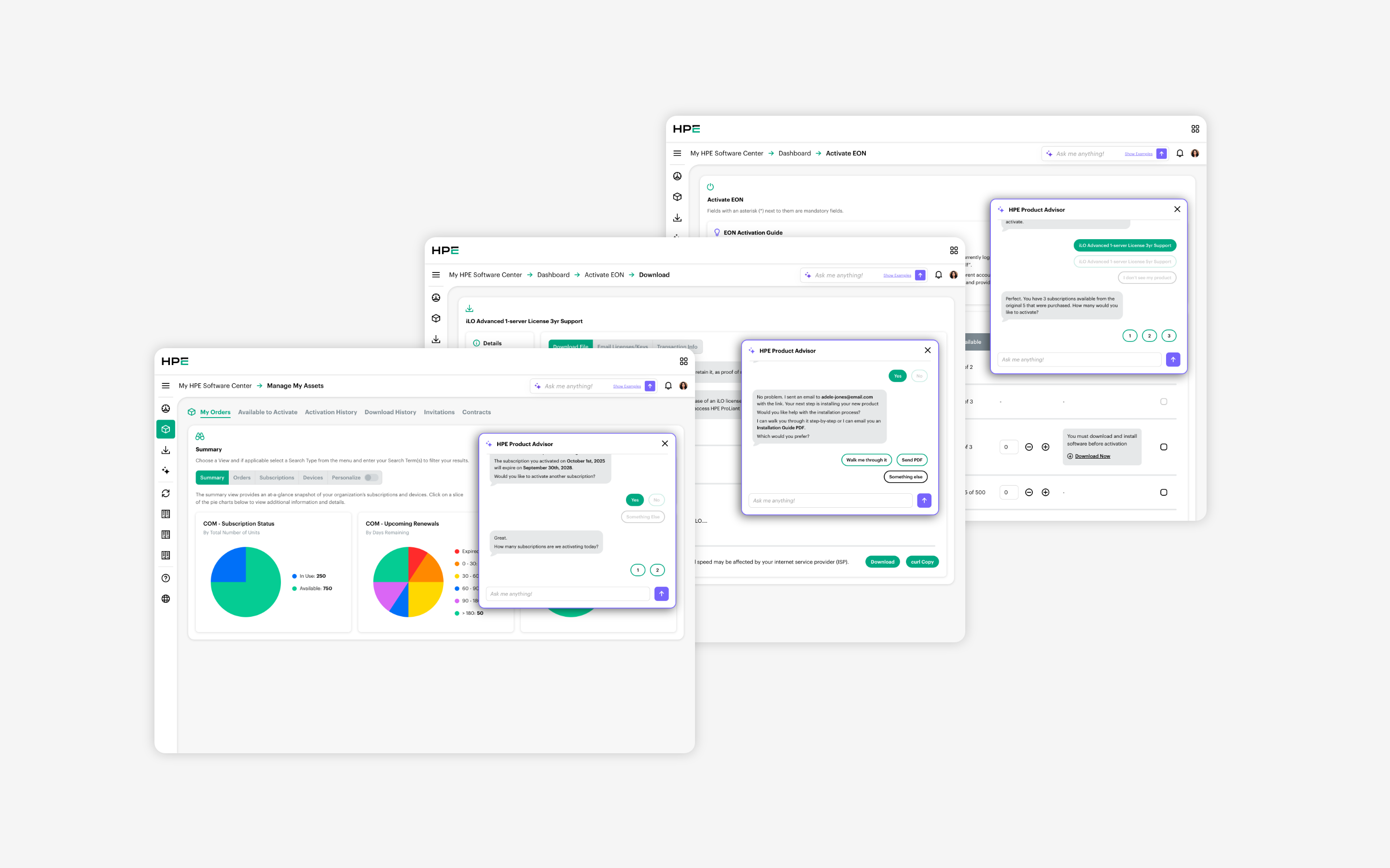
Look at any demo screen and notice how much the AI says. "No problem, Adele. Displaying that information in the table below." Then: "Got it — Filter by Subscription Key." Then: "All set. Your table has been filtered." Three turns of explicit acknowledgment for what is, mechanically, one filter operation.
That verbosity is deliberate. In B2B procurement, an AI that silently does what it thinks you meant is dangerous — users are managing real subscriptions with real money attached. So the assistant narrates: here's what I heard, here's what I'm about to do, here's what I did. Transparency isn't a feature. It's a posture.
OUTCOME
Two pitches, then a governance reckoning.
The work was presented twice — first to our regular HPE contact, then to senior MSC leadership. The prototype was the jewel of both. The deck did the strategic work, but the prototype was where an unfamiliar idea became something leadership could see, click, and react to. Without it, the POV stayed as bullet points.
It landed where vision work is supposed to land: it was credible enough to surface organizational questions HPE hadn't yet answered. Building what we'd just demoed wasn't a design problem at that point — it was a governance problem, a policy problem, a legal problem. The work paused on the build side because the prerequisite work hadn't been done.
In the months following, HPE established its AI governance framework — governance policies, guidance principles, a generative AI use policy, assessment guidelines. Some of that was almost certainly accelerated by the Juniper Networks acquisition, which repositioned the company as AI-native and raised the stakes across the enterprise.
What I'll claim is the modest version: the vision contributed to a broader push toward AI governance, and the prototype made the future concrete enough to plan against.
REFLECTION
What stays with me.
Designers who do a lot of shipped work tend to undervalue vision projects because they don't end with a launch. But shipping isn't the only outcome a piece of design can have. Sometimes the outcome is that an organization sees its own future clearly enough to realize it isn't ready — and goes and gets ready. That's a real result, and it's the kind senior design is uniquely positioned to deliver.
The other thing is about AI surfaces. Chat-as-the-whole-screen is wrong for almost any context where the user is doing real work that produces real outputs. The conversation isn't the product. It's the input mechanism for the product. Once we made that move, most of the other decisions became consequences of it rather than choices we had to make one at a time.