Arrow Electronics
One hub, built around a bullseye.
An independent freelance project: a company-wide internal tool and asset hub for Arrow Electronics, giving new hires and every department a single, standardized place to onboard and find information — organized around a radial "bullseye" structure on desktop, redesigned as an animated stack for mobile.
ROLE
Lead UX/UI Designer (independent/freelance)
CLIENT
Arrow Electronics
TEAM
Sibling Rivalry (design/motion collaboration); independent dev partners for build
BACKGROUND
A company too big to onboard casually.
This one was a side project, outside of Stellar entirely. Arrow Electronics had no standardized way to onboard new employees, and no single source of truth for company information across its many departments — Components, Enterprise Computing Solutions, Intelligent Solutions, Supply Chain, Capabilities, Expertise, Services, Subsidiaries. Information lived wherever it happened to live. A new hire trying to understand the company they'd just joined had no real starting point.
I came on as Lead UX/UI Designer, partnering with Sibling Rivalry on design and motion, and brought in my own development partners to build and ship it.
THE CHALLENGE
Making a sprawling org chart feel like something you'd actually want to explore.
Arrow isn't a simple company to explain. It spans multiple business units, each with its own scope, language, and materials — presentations, one-pagers, videos. The obvious failure mode was building something that felt like an org chart: technically complete, structurally correct, and completely uninviting to actually click through.
The second challenge showed up once the core concept existed: the design that worked conceptually didn't translate directly to mobile. A radial structure with a center and orbiting segments is a strong desktop metaphor, but there's no clean way to compress a bullseye onto a phone screen without either shrinking it into illegibility or losing the metaphor entirely.
THE WORK
A bullseye that becomes a stack.
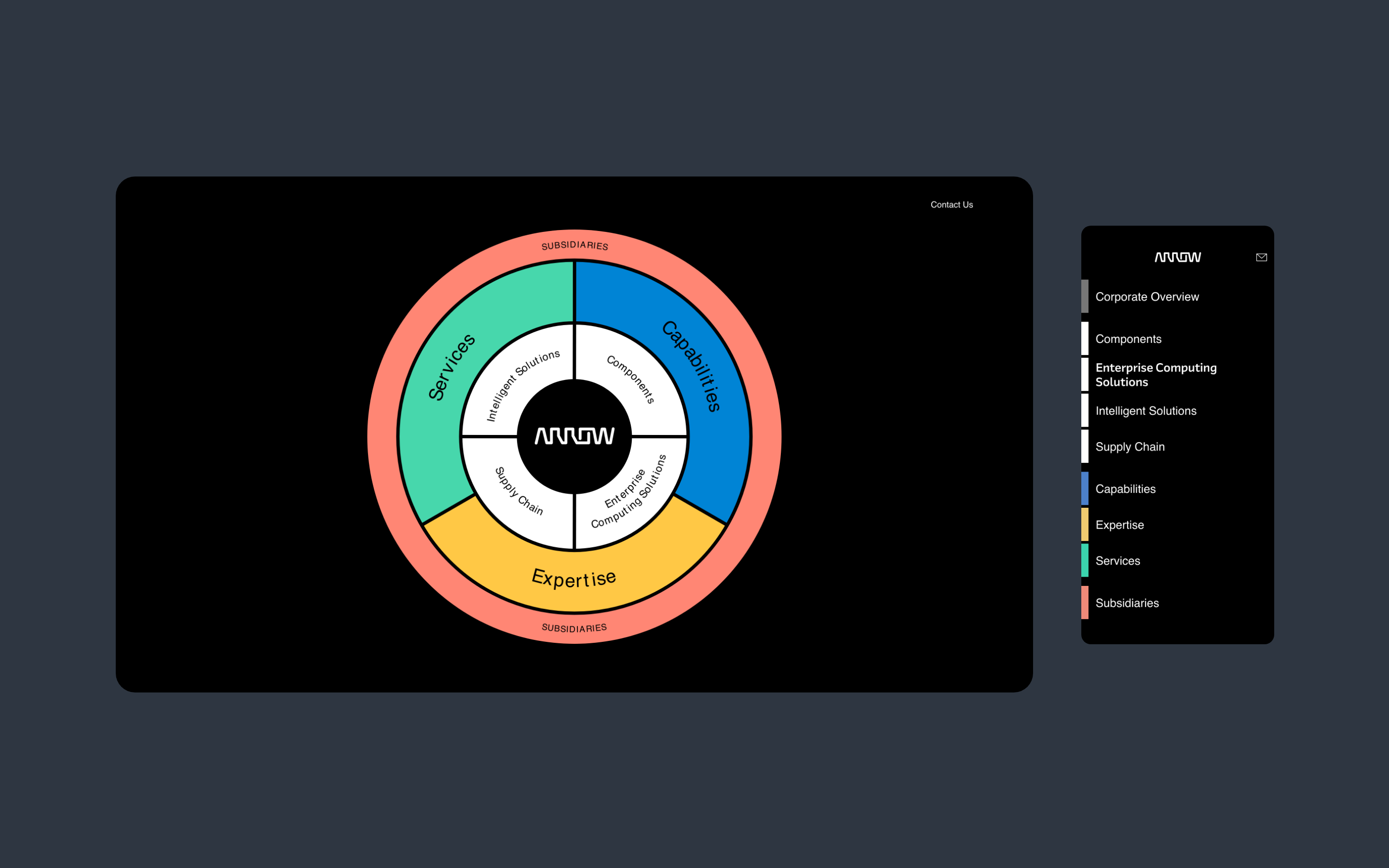
The core concept was a literal bullseye: Arrow's logo at the center, an inner ring of business units, and an outer ring of company-wide categories. Every segment was explorable — clicking in took an employee to a dedicated page with a full-bleed video background, a summary, and direct access to a presentation, a one-pager, and a link to go deeper.
The structure worked because it visualized something true about Arrow: a company organized as concentric layers, with a small set of core disciplines at the center and the full breadth of business units around it — rather than a flat list pretending everything was equally close to the middle.
For mobile I didn't try to preserve the bullseye literally. I redesigned it as an animated stacked list that held the same content and the same sense of moving from general to specific, but worked as a natural scrolling pattern instead of a radial one. Same information architecture, different spatial metaphor.
OUTCOME
The smoothest rollout Arrow had ever done.
The hub launched company-wide. Arrow told us directly that it was the smoothest employee rollout they'd ever done — a result of the design holding up cleanly across desktop and mobile, and the internal and development teams executing the build without friction.
REFLECTION
The metaphor has to survive translation.
The lesson I keep coming back to from this project: a strong concept isn't automatically a strong system. The bullseye was the right idea for desktop — it made an enormous company feel navigable and gave structure real visual meaning. But the real design work was recognizing, early, that the same idea couldn't just be scaled down for mobile. It had to be re-expressed in a completely different spatial language while keeping the same underlying logic intact.
That's the part of design work I find most interesting: not inventing the clever concept once, but making sure the concept still holds up when the constraints change completely underneath it.